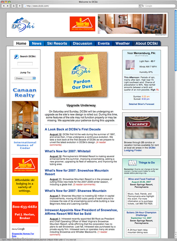
Redesign of DCSki 🔗
Over the past couple months, I have been spending my nights and weekends redesigning DCSki.com, a winter sports publication I run. I launched the redesigned site last night. DCSki hadn't undergone a major redesign since the summer of 2004, when the entire infrastructure of the site was re-written from scratch. During that redesign, nearly all content located on the site was moved to a relational database. (Previously, only metadata was stored in the database.) That infrastructure has worked and scaled extremely well and required no changes during this summer's redesign. Instead, I focused my efforts on changing DCSki's "look and feel."A historical look at the evolution of DCSki is provided here. Each year, more and more features would be added to DCSki, and this began to weigh heavily on the layout of the site. Many pages had become a cluttered mess, and although DCSki offered many extremely useful features, I suspected that average readers were having trouble finding them.
On the other hand, readers had regularly praised the layout and design of DCSki. Generally, the layout worked, so I did not want to dismiss reader familiarity with a radical overhaul. Ironically, keeping a common thread of familiarity from the old design to the new one required more work. I put a great deal of thought and engineering into each and every page on the site, trying to think of both subtle and significant ways of improving the presentation and interaction of the page's content, while making the new design familiar and approachable.
Some aspects of the new site took days to implement. For example, I spent many hours designing DCSki's new page-top, top-level menu, which includes seven choices (Home, News, Ski Resorts, Discussions, Events, Weather, and About DCSki). It took several tries before I settled on these top-level categories, which attempt to encapsulate over two dozen separate features on DCSki. Although the menu only has seven choices, I had to painstakingly generate 46 separate images that are used like interlocking puzzle pieces to create all of the possible states of the menu. Why so many? Because I decided to go for a little extra polish. A menu item can be in one of three states (selected, not selected, or hovered over by the mouse), and each item is slightly curved, casting a drop shadow on neighboring items. If I had used pure rectangles without drop shadows, the number of separate states would have been slashed, but the menu wouldn't have looked as "nice." In effect, I spent a lot of effort adding polish that will not be noticed overtly by readers; but it will be noticed subconsciously and make DCSki stand out a bit from typical web sites. Why spend so much time on this? Because the main menu shows up prominently on each of DCSki's thousands of pages, and will be the user interface elements readers interact with the most.
By far, the most frustrating aspect of this redesign was dealing with Internet Explorer's multitude of rendering bugs. IE is such a steaming pile of dog doo! Each time I painstakingly laid out a page, I would test the page in Safari and FireFox, and it would render perfectly. I would then try bringing up the page in Internet Explorer running on Windows. Almost without exception, it would fail in some colossal way due to one of IE's many documented (and long-standing) rendering bugs. Often it took awhile to find a reasonable work-around. I have had to make some compromises just to support IE in a sane way. There are still some pixel-level imperfections caused by IE (or trying to support IE) that annoy me when I notice them, but they will probably be unnoticeable to the majority of DCSki readers. Seriously, IE is a piece of junk. No other modern browser gets the CSS box model wrong. But, Google Analytics shows that, over the past year, (gasp!) 73.91% of DCSki readers were using IE. 20.21% were using Firefox, 4.46% were using Safari, and 0.71% were using Netscape. 0.17% were using Opera, and 0.04% were using Camino.
I'm sure I will continue to squash IE bugs with the new design for some time to come.
Here is what the redesigned home page for DCSki looks like: